I've shown a lot of color plots of complex functions on this blog to demonstrate complex functions in mpmath. These plots are informative, but sometimes a 3D plot (typically of the function's absolute value) gives a much better view. A big advantage of 3D plots over 2D color plots is that far fewer evaluation points are required for a good high-resolution image, and this helps when visualizing the slower functions in mpmath.
There will probably be a 3D plot function in a future version of mpmath (or two functions; for two-variable real, and complex functions), similar in style to the existing matplotlib wrappers plot and cplot. Until I've figured out the details, I'll share a couple of test plots.
Coulomb wave function of a complex argument, F(6,4,z):
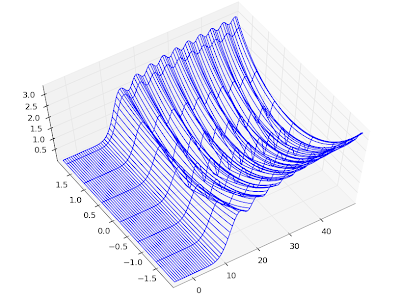
Principal-branch logarithmic gamma function:
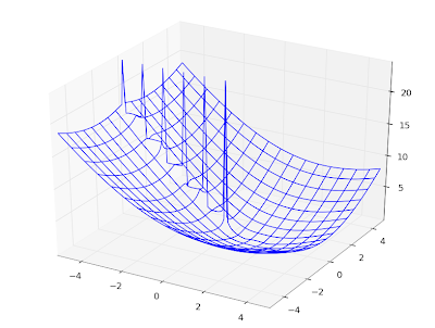
Gamma function:
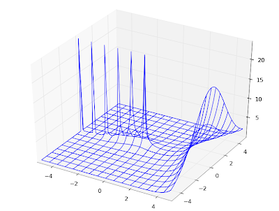
Imaginary part of Lambert W function, 0th branch:
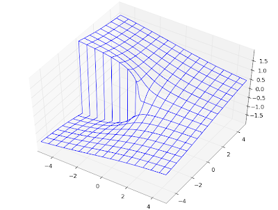
Riemann zeta function in the critical strip:
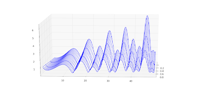
Those are all wireframe plots. It's also possible to do surface plots. Using the Riemann zeta function again, a surface plot looks as follows:
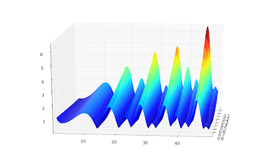
Surface + wireframe plot:
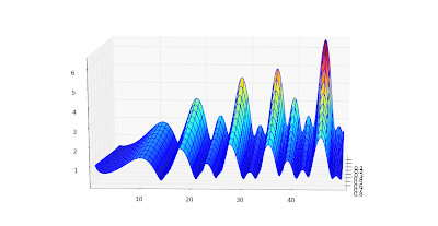
None of these is perfect. I'd like to be able to do a surface plot with a widely spaced wireframe mesh to pronounce the geometry, and smooth colored surface between the meshes. This doesn't seem possible with matplotlib because the surface plot doesn't do smoothing (even with a stride selected); overlaying a wireframe works decently, but the wireframe doesn't render with occlusion and this looks bad for some functions. Since the pure wireframe plot is much faster, I think I prefer it for now.
For complex functions, it'd also be nice with a color function separate from the geometry function -- then you could plot the phase as color in the same picture.
Color helps for visualizing complicated structure, especially for phase plots. Below, I've plotted the phase (actually the sine of the phase, to make it continuous) of a Jacobi theta function θ3(1+4j/3,q) (restricted to |q| < 0.8, because it gets extremely messy for larger |q|):
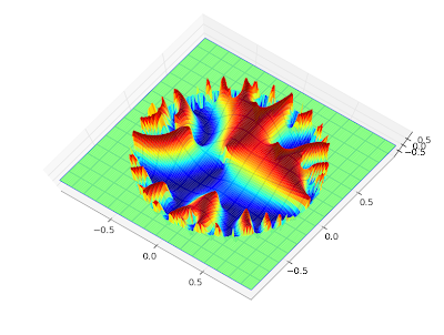
The phase of the Barnes G-function:
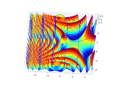
I could do many more, but that will probably enough for this blog :-)
To reproduce any of these, use the following script with trivial modifications. It's a straightforward extension of the example scripts in the matplotlib documentation.
from mpl_toolkits.mplot3d import Axes3D
from matplotlib import cm
import pylab
import numpy as np
import mpmath
mpmath.dps = 5

# Use instead of arg for a continuous phase
def arg2(x):
    return mpmath.sin(mpmath.arg(x))

#f = lambda z: abs(mpmath.loggamma(z))
#f = lambda z: arg2(mpmath.exp(z))
#f = lambda z: abs(mpmath.besselj(3,z))
f = lambda z: arg2(mpmath.cos(z))

fig = pylab.figure()
ax = Axes3D(fig)
X = np.arange(-5, 5, 0.125)
Y = np.arange(-5, 5, 0.125)
X, Y = np.meshgrid(X, Y)
xn, yn = X.shape
W = X*0
for xk in range(xn):
    for yk in range(yn):
        try:
            z = complex(X[xk,yk],Y[xk,yk])
            w = float(f(z))
            if w != w:
                raise ValueError
            W[xk,yk] = w
        except (ValueError, TypeError, ZeroDivisionError):
            # can handle special values here
            pass
    print xk, xn

# can comment out one of these
ax.plot_surface(X, Y, W, rstride=1, cstride=1, cmap=cm.jet)
ax.plot_wireframe(X, Y, W, rstride=5, cstride=5)

pylab.show()
8 comments:
Read your comment about smoothing -- I couldn't agree more, and the good news is we are working on it and have part of the hard part, gouraud shading over a mesh, implemented in svn HEAD, but this is still a work in progress, and the 3d stuff is not yet using it (it is working for the quad mesh demo, with dramatically better results for a much coarser grid). Look for it in mpl 1.0, maybe a month or so.
JDH
John, that sounds great.
Are there any plans to add function plotting, and surface plots with a separate color function, to matplotlib as well?
Function plotting is on the wish list, but I wouldn't say plans because nobody is actively working on it. There is both an easy and hard component to this -- I could whip up something that does function plotting in just an hour or so, but to do it right you want to do adaptive sampling of the line or plane over which you are function plotting, so you have just the ight number of points for some error tolerance. This is a bit outside my area of expertise, but I work closely with Fernando Perez (I'll be rooming with him next week at scipy) and this is at the core of his PhD specialty, so maybe I can force him to finally do this for us.
As for a separate color function, we are discussing support of a user specified color array, but I hadn't considered a function. Would be able to specify the colors suffice for you, or would a function be more useful?
Right, it's trivial to evaluate a function over a linspace, so it should be adaptive to be worthwhile. This feature would have my vote.
A color array should work just fine for an array plot (a function would be better for a function plot).
A simple example, which would make a good addition to the matplotlib tutorial, would be a color plot of spherical harmonics on a sphere.
A cut of an adaptive interpolator,
please comment --
adalin2( func, near, nx=300, ny=150, xstep=32, ystep=16,
xrange=(0,1), yrange=(0,1), dtype=np.float, norm=abs )
Purpose:
interpolate a function on a regular 2d grid:
take func() where it changes rapidly, bilinear interpolate where it's smooth.
Keywords:
adaptive interpolation, recursive splitting, bilinear, Python, numpy
Example:
x,y,z = adaline( ... )
fig = pylab.figure()
ax = mpl_toolkits.mplot3d.Axes3D( fig )
X, Y = np.meshgrid( x, y )
ax.plot_wireframe( X, Y, z, rstride=5, cstride=5 )
I´m trying to do a 3D plot of a X,Y, Pressure-graph. How do I convert the data to the format that the plot command want a numpy array or a meshgrid. I have the data in the following format:
X_coordinat, Y_coordinat, Pressure_value.
...,...,...
...,...,...
...,...,...
Can you please help me?
Hello, great post! I have just started using matplotlib and I was trying to create multiple wireframe spheres on the same axis. I am running into some troubles, summarized here: http://stackoverflow.com/questions/12296856/python-matplotlib-wireframe-distortion
I was wondering if you could help with that.
Thanks!
Post a Comment